These options are located in the Theme Options > Global Typography > Headings Typography tab.
Customize headings fonts used global. Headings are defined with the <h1> to <h6> tags. See Typography Options Overview
Headings Typography options (Fig. 1)
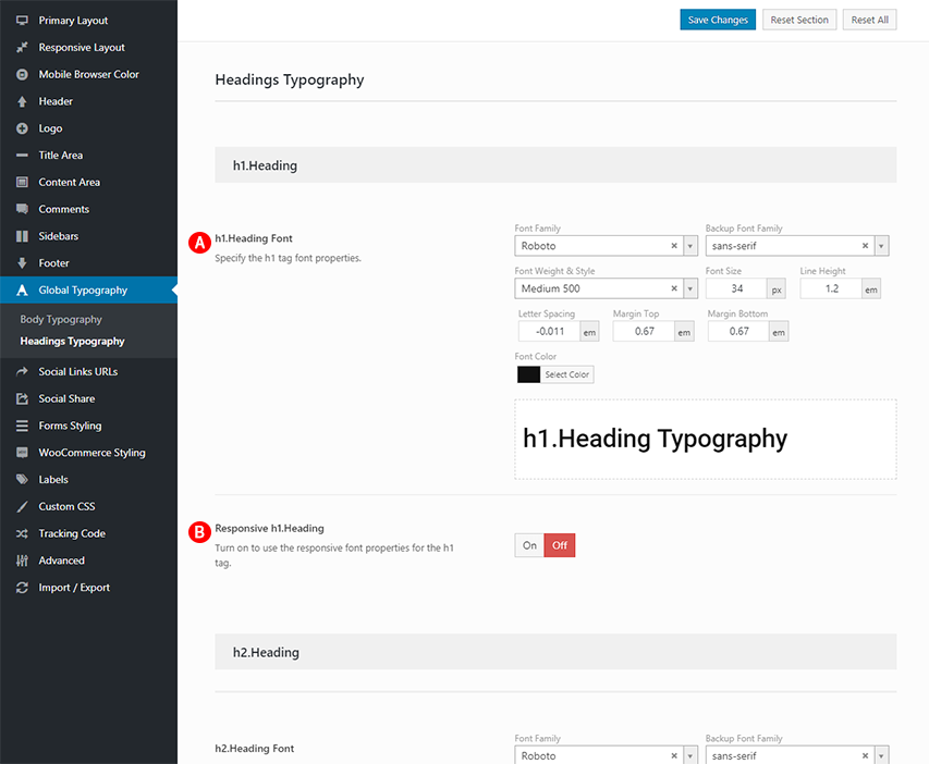
Below is an example <h1> Headings Typography options
h1.Heading Font – Illustrated as A. Specify the h1 tag font properties. See General Typography settings
Responsive h1.Heading – Illustrated as B. Turn on to use the responsive font properties for the h1 tag.
Responsive Heading (Fig. 2)
IMPORTANT NOTE
Responsive Heading options are available only if you are turn on responsive design in responsive layout.
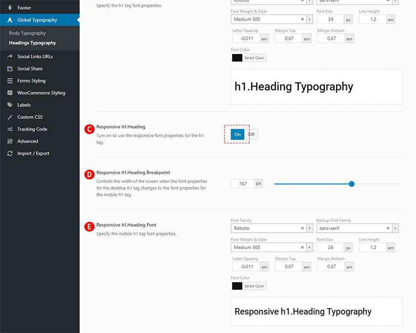
Below is an example Responsive <h1> Headings options
Responsive h1.Heading – Illustrated as C. Turn on to use the responsive font properties for the h1 tag. Illustrated as C is set to Illustrated as B on.
Responsive h1.Heading Breakpoint – Illustrated as D. The Responsive h1.Heading Breakpoint is a specific pixel value of the screen width that changes the desktop layout to mobile layout. For example, if you set the value of the ‘Responsive h1.Heading Breakpoint’ option to 767px, the desktop h1 tag will changes to the mobile h1 tag if the width of the screen is 767px and under. Controls the width of the screen when the font properties for the desktop h1 tag changes to the font properties for the mobile h1 tag.
Responsive h1.Heading Font – Illustrated as E. Specify the mobile h1 tag font properties.