These options are located in the Theme Options > Header > Desktop Header tab. Then go to the Desktop Header Main Menu Typography section.
Desktop Header Main Menu Typography options control the styles and typography for the main menu of the desktop header on your site. See Typography Options Overview
The main menu setting of the desktop header is: See Setting Up The Menu
First of all, let’s find out about the terms used in this document.
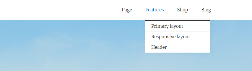
Main Menu Dropdown
Main Menu Dropdown is a menu list that appears when you hover over the top-level item in the main menu. (Fig. 1)
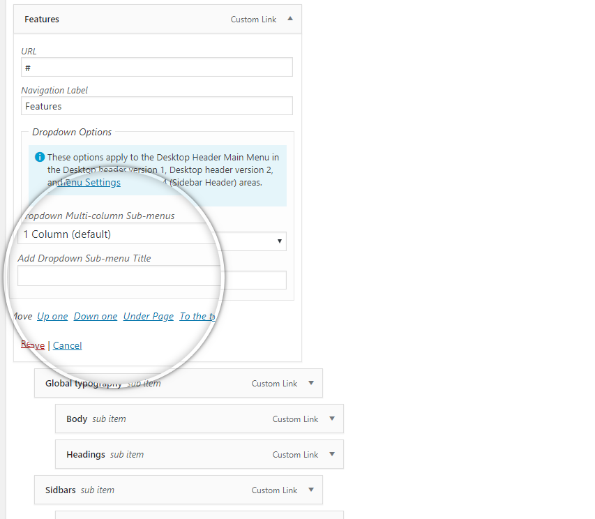
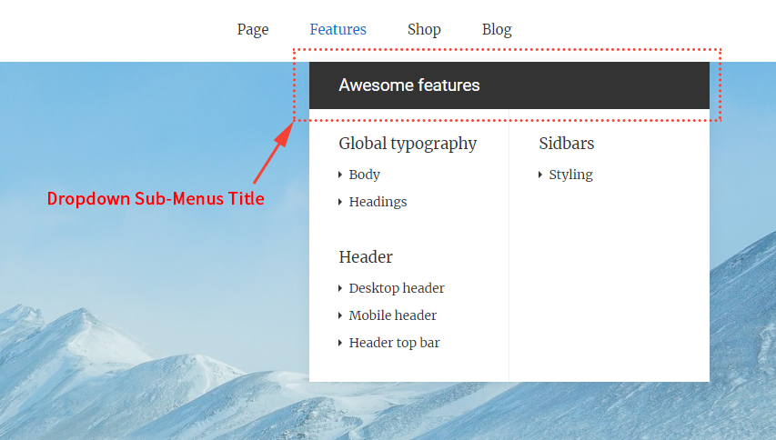
Dropdown Sub-Menus Title
Sonnet can add the Dropdown Sub-menu Title you want to your desktop main menu. (Fig. 2) See Menu Settings
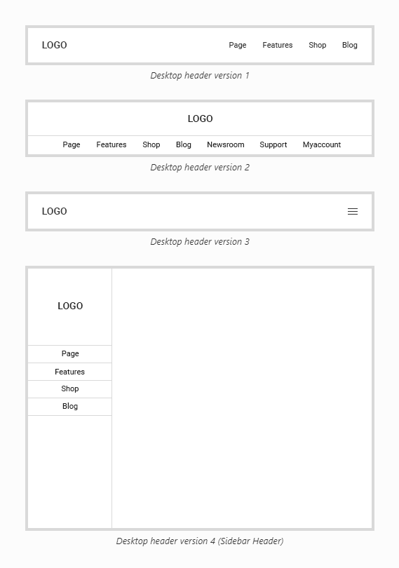
Sonnet offers a range of 4 customizable header layout versions (Fig. 3) to suit your site’s needs. Also, the Desktop Header Background options are suggested that must be controlled for that desktop header when setting the version of the desktop header set in the Desktop Header Layout.
If the Desktop Header Layout option is selected as Desktop Header Version 3, the Dropdown Sub-Menus Title will not be displayed in the desktop main menu.
All versions except desktop header version 3 are shown in desktop main menu. (Fig. 4)
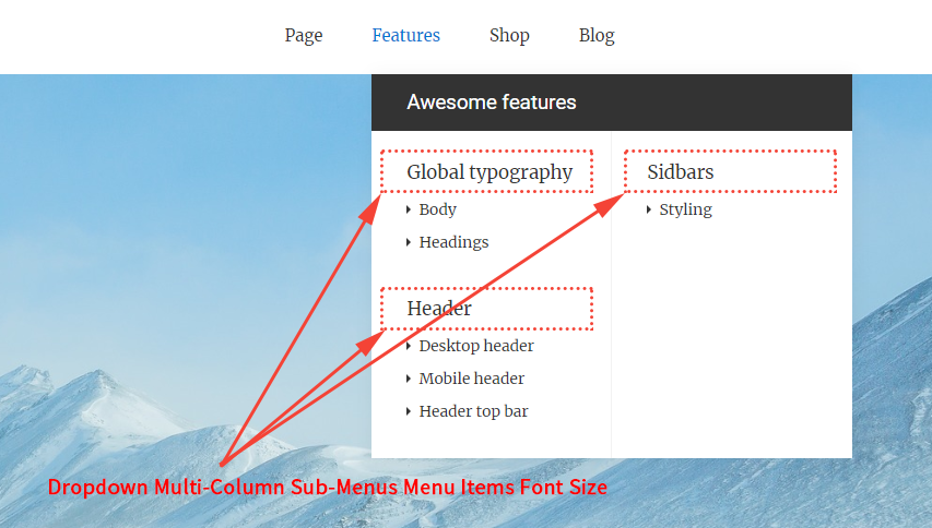
Dropdown Multi-Column Sub-Menus Menu Items Font Size With Hierarchical Depth Of 1 On The 2, 3 Or 4(Full width) Columns Sub-Menus Style
Sonnet offers a column of 4 customizable Dropdown to suit your site’s needs. See Menu Settings
“Dropdown Multi-Column Sub-Menus Menu Items Font Size With Hierarchical Depth Of 1” in the top-level item of the main menu on the Appearance > Menus page means a Sub-Menus Menu Items Font Size With Hierarchical 1 depth when selected as “2 columns” or “3 columns” or “Full Width (4 columns)”. (Fig. 3) (Fig. 5)
Desktop header version 1,
Desktop header version 2,
Desktop header version 4 (Sidebar Header)
If you select the Desktop Header Layout option as Desktop header version 1 or Desktop header version 2 or Desktop header version 4 (Sidebar Header), the Desktop Header Main Menu Typography options you need to control are (Fig. 6):
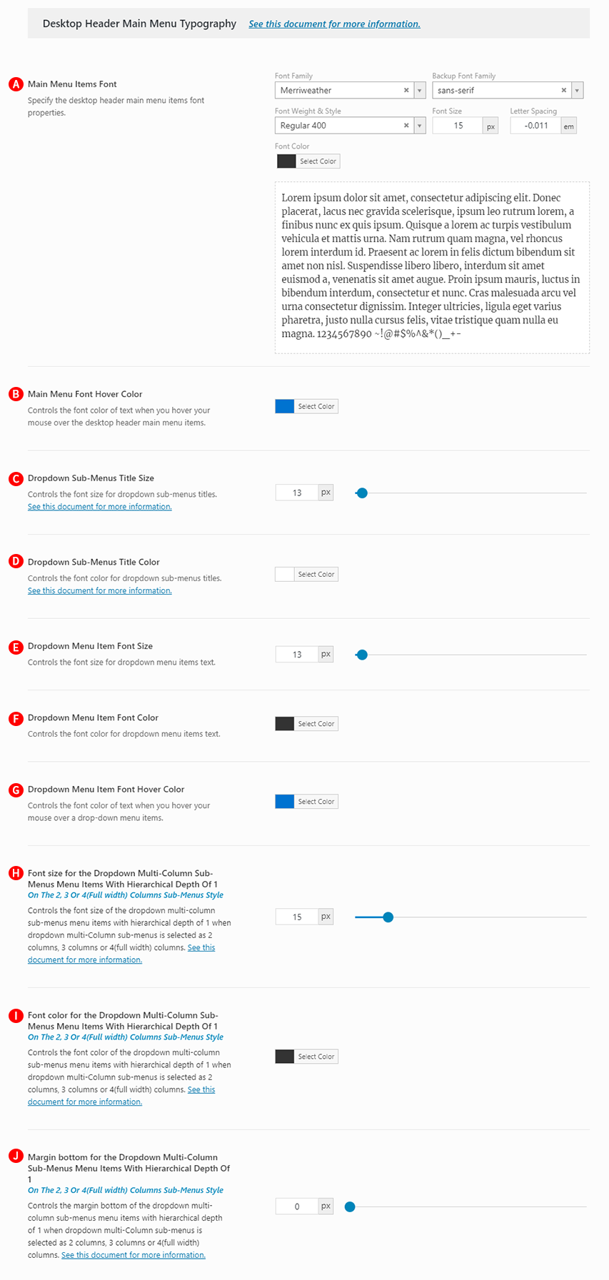
Main Menu Items Font – Illustrated as A. Specify the desktop header main menu items font properties.
Main Menu Font Hover Color – Illustrated as B. Specify the color of the desktop header main menu text hover. Also, used to highlight current main menu item.
Dropdown Sub-Menus Title Size – Illustrated as C. Controls the font size for dropdown sub-menus titles.
Dropdown Sub-Menus Title Color – Illustrated as D. Controls the font color for dropdown sub-menus titles.
Dropdown Menu Item Font Size – Illustrated as E.Controls the font size for dropdown menu items text.
Dropdown Menu Item Font Color – Illustrated as F. Controls the font color for dropdown menu items text.
Dropdown Menu Item Font Hover Color – Illustrated as G. Controls the font color of text when you hover your mouse over a drop-down menu items.
Font size for the Dropdown Multi-Column Sub-Menus Menu Items With Hierarchical Depth Of 1On The 2, 3 Or 4(Full width) Columns Sub-Menus Style – Illustrated as H. Controls the font size of the dropdown multi-column sub-menus menu items with hierarchical depth of 1 when dropdown multi-Column sub-menus is selected as 2 columns, 3 columns or 4(full width) columns.
Font color for the Dropdown Multi-Column Sub-Menus Menu Items With Hierarchical Depth Of 1On The 2, 3 Or 4(Full width) Columns Sub-Menus Style – Illustrated as I. Controls the font color of the dropdown multi-column sub-menus menu items with hierarchical depth of 1 when dropdown multi-Column sub-menus is selected as 2 columns, 3 columns or 4(full width) columns.
Margin bottom for the Dropdown Multi-Column Sub-Menus Menu Items With Hierarchical Depth Of 1 On The 2, 3 Or 4(Full width) Columns Sub-Menus Style – Illustrated as J. Controls the margin bottom of the dropdown multi-column sub-menus menu items with hierarchical depth of 1 when dropdown multi-Column sub-menus is selected as 2 columns, 3 columns or 4(full width) columns.
Desktop header version 3
If you select the Desktop Header Layout option as Desktop header version 3, the Desktop Header Main Menu Typography options you need to control are (Fig. 7):
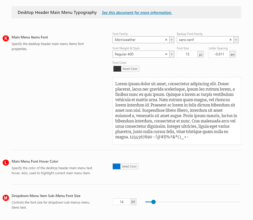
Main Menu Items Font – Illustrated as K. Specify the desktop header main menu items font properties.
Main Menu Font Hover Color – Illustrated as L. Specify the color of the desktop header main menu text hover. Also, used to highlight current main menu item.
Dropdown Sub-Menus Title Size – Illustrated as M. Controls the font size for dropdown sub-menus titles.