These options are located in the Theme Options > Header > Mobile Header tab. Then go to the Mobile Menu section.
IMPORTANT NOTE
Mobile Menu section is available only if you are turn on responsive design in responsive layout.
Mobile Menu options control the styles for the menu area of the mobile header on your site.
The menu setting of the mobile header is: See Setting Up The Menu
Sonnet offers a range of 2 customizable Mobile Header Menu Style (Fig. 1) to suit your site’s needs, and the Mobile Menu options are suggested that must be controlled for that Mobile Header Menu Style when setting the Mobile Header Menu Style set in the Mobile Header Layout.
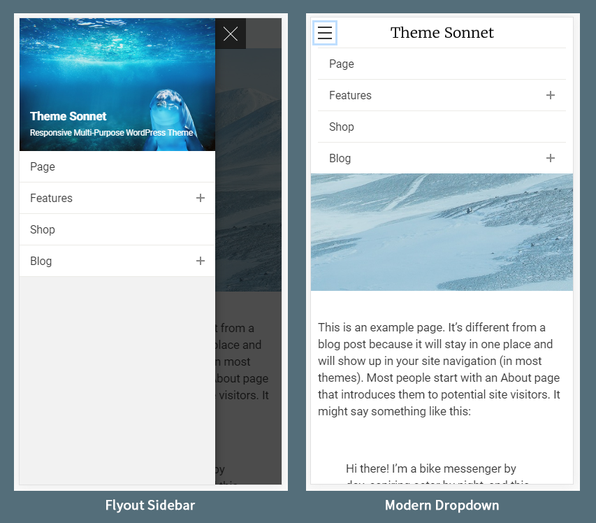
Flyout Sidebar
If you select the Mobile Header Menu Style option as Flyout Sidebar, the Mobile Menu options you need to control are (Fig. 2):
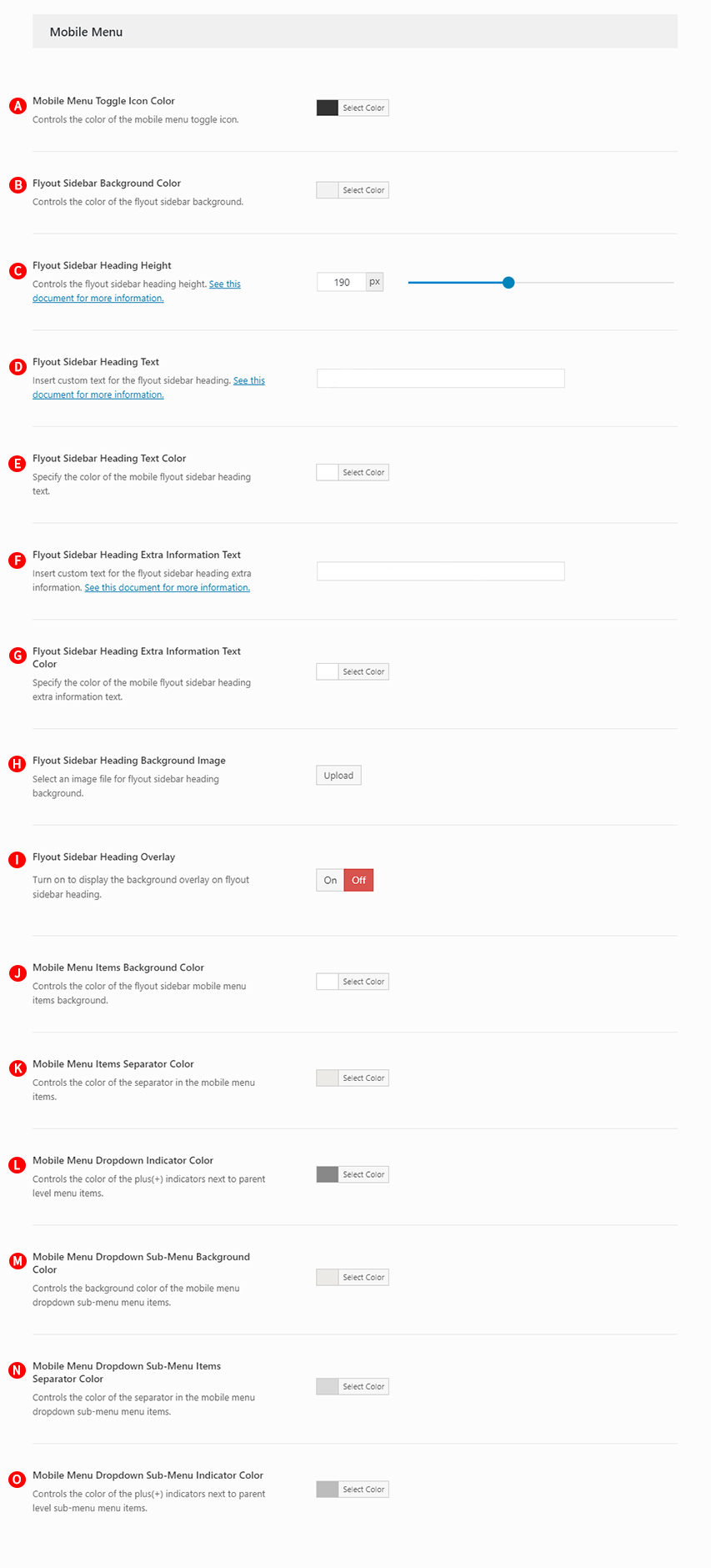
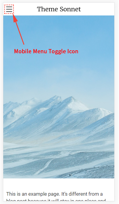
Mobile Menu Toggle Icon Color – Illustrated as A. Controls the color of the mobile menu toggle icon. (Fig. 3)
Flyout Sidebar Background Color – Illustrated as B. Controls the color of the flyout sidebar background.
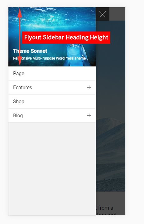
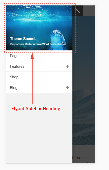
Flyout Sidebar Heading Height – Illustrated as C. Controls the flyout sidebar heading height. (Fig. 4)
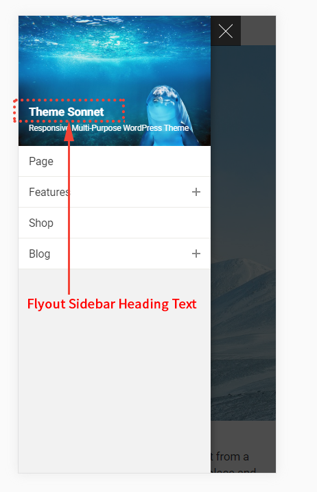
Flyout Sidebar Heading Text – Illustrated as D. Insert custom text for the flyout sidebar heading. (Fig. 5)
Flyout Sidebar Heading Text Color – Illustrated as E. Specify the color of the mobile flyout sidebar heading text.
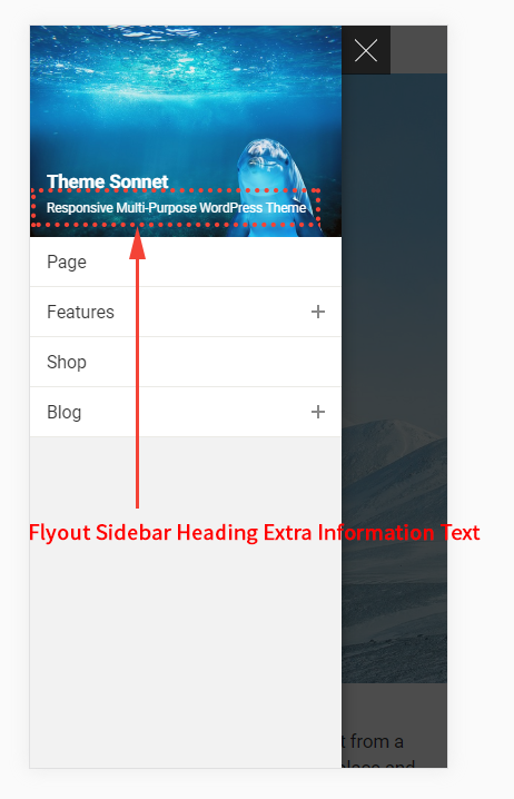
Flyout Sidebar Heading Extra Information Text – Illustrated as F. Insert custom text for the flyout sidebar heading extra information. (Fig. 6)
Flyout Sidebar Heading Extra Information Text Color – Illustrated as G. Specify the color of the mobile flyout sidebar heading extra information text.
Flyout Sidebar Heading Background Image – Illustrated as H. Select an image file for flyout sidebar heading background. (Fig. 7)
Flyout Sidebar Heading Overlay – Illustrated as I. Turn on to display the background overlay on flyout sidebar heading.
If you turn on Flyout Sidebar Heading Background Overlay(– Illustrated as I) and select the value of the Flyout Sidebar Heading Background Overlay Type as ‘Simple Color’(– Illustrated as 1), you will have the options are as follows: (Fig. 8)
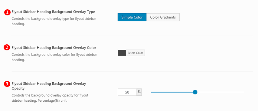
Flyout Sidebar Heading Background Overlay Type – Illustrated as 1. Controls the background overlay type for flyout sidebar heading.
Flyout Sidebar Heading Background Overlay Color – Illustrated as 2. Controls the background overlay color for flyout sidebar heading.
Flyout Sidebar Heading Background Overlay Opacity – Illustrated as 3. Controls the background overlay opacity for flyout sidebar heading. Percentage(%) unit.
If you turn on Flyout Sidebar Heading Background Overlay(– Illustrated as I) and select the value of the Flyout Sidebar Heading Background Overlay Type as ‘Color Gradients’(– Illustrated as 4), you will have the options are as follows: (Fig. 9)
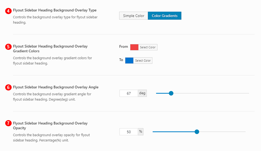
Flyout Sidebar Heading Background Overlay Type – Illustrated as 4. Controls the background overlay type for flyout sidebar heading.
Flyout Sidebar Heading Background Overlay Gradient Colors – Illustrated as 5. Controls the background overlay gradient colors for flyout sidebar heading.
Flyout Sidebar Heading Background Overlay Angle – Illustrated as 6. Controls the background overlay gradient angle for flyout sidebar heading. Degree(deg) unit.
Flyout Sidebar Heading Background Overlay Opacity – Illustrated as 7. Controls the background overlay opacity for flyout sidebar heading. Percentage(%) unit.
Mobile Menu Items Background Color – Illustrated as J. Controls the color of the flyout sidebar mobile menu items background.
Mobile Menu Items Separator Color – Illustrated as K. Controls the color of the separator in the mobile menu items.
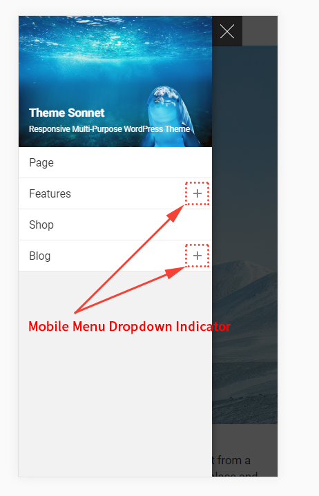
Mobile Menu Dropdown Indicator Color – Illustrated as L. Controls the color of the plus(+) indicators next to parent level menu items. (Fig. 10)
Mobile Menu Dropdown Sub-Menu Background Color – Illustrated as M. Controls the background color of the mobile menu dropdown sub-menu menu items.
Mobile Menu Dropdown Sub-Menu Items Separator Color – Illustrated as N. Controls the color of the separator in the mobile menu dropdown sub-menu menu items.
Mobile Menu Dropdown Sub-Menu Indicator Color – Illustrated as O. Controls the color of the plus(+) indicators next to parent level sub-menu menu items.
Modern Dropdown
If you select the Mobile Header Menu Style option as Modern Dropdown, the Mobile Menu options you need to control are (Fig. 11):
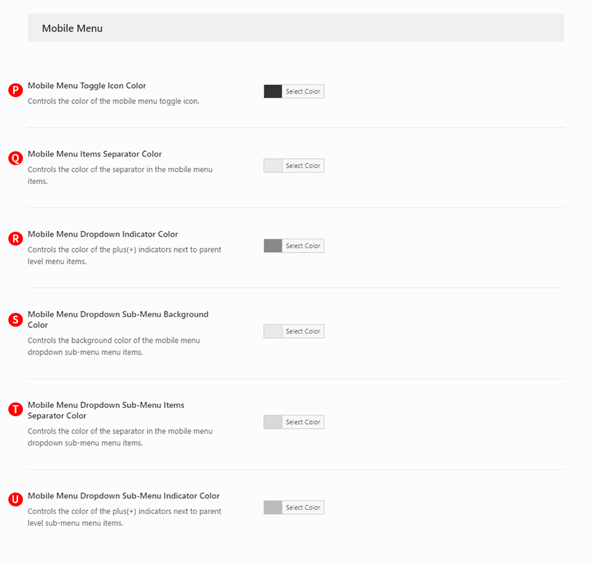
Mobile Menu Toggle Icon Color – Illustrated as P. Controls the color of the mobile menu toggle icon. (Fig. 12)
Mobile Menu Items Separator Color – Illustrated as Q. Controls the color of the separator in the mobile menu items.
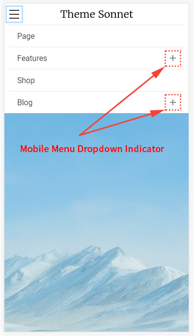
Mobile Menu Dropdown Indicator Color – Illustrated as R. Controls the color of the plus(+) indicators next to parent level menu items. (Fig. 13)
Mobile Menu Dropdown Sub-Menu Background Color – Illustrated as S. Controls the background color of the mobile menu dropdown sub-menu menu items.
Mobile Menu Dropdown Sub-Menu Items Separator Color – Illustrated as T. Controls the color of the separator in the mobile menu dropdown sub-menu menu items.
Mobile Menu Dropdown Sub-Menu Indicator Color – Illustrated as U. Controls the color of the plus(+) indicators next to parent level sub-menu menu items.