These options are located in the Theme Options > Header > Mobile Header tab. Then go to the Mobile Header Layout section.
IMPORTANT NOTE
Mobile Header Layout section is available only if you are turn on responsive design in responsive layout.
Mobile Header Layout options control the general layout of the mobile header on your site. (Fig. 1)
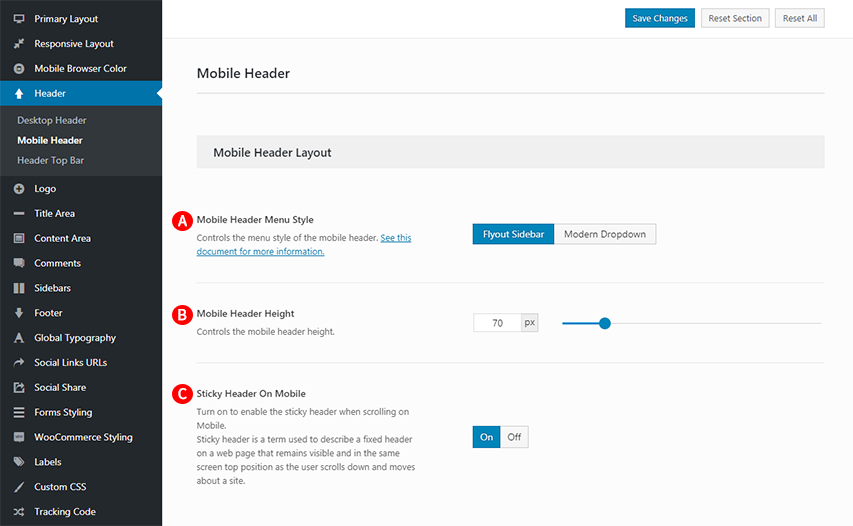
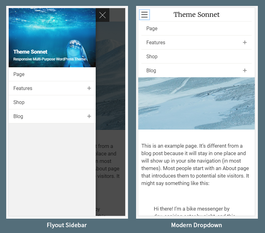
Mobile Header Menu Style – Illustrated as A. Controls the menu style of the mobile header. (Fig. 2)
Mobile Header Height – Illustrated as B. Controls the mobile header height.
Sticky Header On Mobile – Illustrated as C. Turn on to enable the sticky header when scrolling on Mobile. Sticky header is a term used to describe a fixed header on a web page that remains visible and in the same screen top position as the user scrolls down and moves about a site.